9News LinkStream
New routes for News
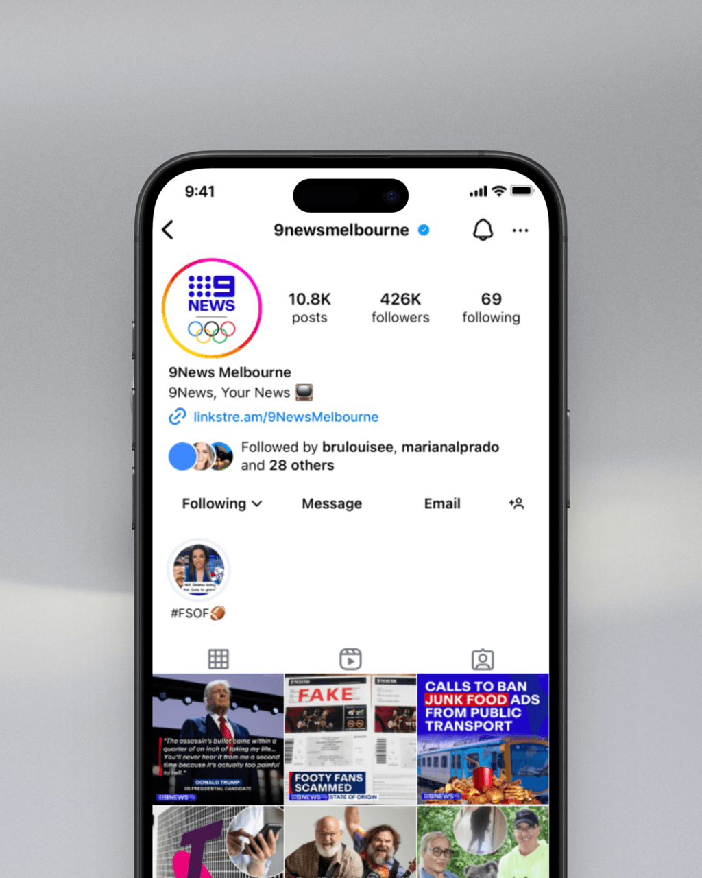
Helping 9News readers go from Instagram to article, without getting lost along the way
I designed this UX concept for 9News to solve a recurring frustration I saw as both a designer and a reader: Users coming from Instagram posts were landing on a generic homepage instead of the article they expected and many dropped off before ever finding what they clicked for.
This project explores how structure, visual familiarity, and filtering could transform that moment of confusion into a moment of connection.
Timeline
Jun-Jul 2024
Team
Independent conceptual project
My role
UX & Product Designer
(concept, research, UX flows, UI, prototyping)
Impact
- Surfaced relevant articles faster from Instagram links
- Reduced friction in navigating recent and related news
- Increased content retention within the 9News ecosystem
Final solution (mobile): recorded prototype / large screens
Why readers dropped off before the story even started
Instagram was driving traffic to 9News — but not to the right place. Readers tapping on news links landed on a crowded homepage, with no clear path to the article they came for.
Some scrolled. Some gave up.
A few even Googled headlines to work around the system.
"I usually don't find the article. I wonder if that's their intention — to keep people lost."– User interview
The challenge: help users follow stories from post to page without friction or second-guessing.
Mapping where user trust disappears
I mapped the user experience from Instagram post to article and where confidence dropped.
The current path relied on memory, search, and luck. A disjointed flow made discovery feel like a scavenger hunt.
emotional journey map:

Rebuilding the journey to feel as clear as it looks
I redesigned the experience around two key principles:
- Visual familiarity: an Instagram-style grid to match user expectations
- Content clarity: clear headlines and direct links to live articles
Each interaction was designed to remove ambiguity and help users quickly identify what they came for.

Two ways in: visual scan or structured filter
Not every user navigates the same way, so I gave them two modes:
- A visual grid that mirrors Instagram, helping users recognise and scan stories
- A genre filter that lets users refine results and quickly access what matters to them
Both options came directly from early feedback. Most wanted to browse by topic or find other relates articles.


tap on the image to see the filtering feature in action
Content became easier to find and easier to follow
- Users landed on the articles they expected, reducing frustration
- Relevant articles were surfaced faster, improving discovery
- Navigation friction dropped across all entry points
- Projected outcomes included reducing user drop-off and tripling article access speed
It wasn't about fixing a link, it was about fixing the journey
This project showed me how small structural decisions can unlock clarity. Discovery design matters, especially when attention is fragile.
It also strengthened my skills in UX research, emotional journey mapping, and designing for clarity at speed. As a designer, I learned how to balance stakeholder goals with user trust, and how clarity often comes not from doing more, but from doing just enough.
